This article was co-authored by wikiHow Staff. Our trained team of editors and researchers validate articles for accuracy and comprehensiveness. wikiHow's Content Management Team carefully monitors the work from our editorial staff to ensure that each article is backed by trusted research and meets our high quality standards.
There are 16 references cited in this article, which can be found at the bottom of the page.
The wikiHow Video Team also followed the article's instructions and verified that they work.
This article has been viewed 9,129 times.
Learn more...
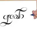
Typography is the art of designing, arranging, and styling the appearance of text.[1] With typography, you’ll be able to communicate or emphasize more than what’s actually contained in the text itself. To create your own typography design, it’s important that you first choose the typefaces you want to incorporate into your design. Then, you can decide on the other important elements of your design while keeping a few best practices in mind.
Steps
Choosing a Typeface for Typography Designs
-
1Match the mood of your design to the intended message. When deciding what typeface to use in your typography design, look at each typeface you’re considering and assess what it says to you. In most cases, typefaces have qualities and characteristics that give them a specific feeling or mood. Therefore, it’s important that you make sure that the feeling it evokes is consistent with the message of the text or product.[2]
- For example, if you’re creating typography for an all-natural, minimal ingredient lotion bottle, you’ll likely want to keep the design simple to match the simplicity of the product. Therefore, a simple sans-serif typeface is likely the best choice.
- If your typography design is for a young audience, you’ll likely want to choose a font that evokes a more lighthearted, playful tone, such as a casual script.
-
2Use serif typefaces for more traditional projects. Serif typefaces often have a classic look, making them a great choice for typography designs for traditional projects, such as serious-toned greeting cards and magazines.[3] While they can get a bit ornate, more simplistic serif designs are easily recognizable and easy to read, which is why these typefaces are often used for more authoritative texts, such as newspapers.Advertisement
-
3Try a sans-serif typeface if you’re designing for a digital medium. Sans-serif typefaces tend to be more modern and clean than serif, script, or decorative options. This can make them easier to read in digital formats, such as texts made to be displayed on computers, smartphones, tablets.[6]
-
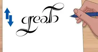
4Go for a script typeface if you want a historical, romantic vibe. If you’re creating typography for a wedding invitation, historical fiction book cover, or any text that evokes a sense of romance, history, or nostalgia, a script typeface is a great option. Try to use more ornate, cursive-style script typefaces sparingly, however, as the flourishes and curls can be somewhat difficult to read.[9]
- Script typefaces are those that are designed to mimic handwriting.[10]
- Script typefaces are also a great option for logos when you want to convey a sense of timelessness, such as a logo for a reclaimed furniture shop or rare bookstore.
-
5Limit your use of decorative typefaces to small amounts of text. Like scripts, using decorative typefaces in your typography design is a great way to evoke a particular feeling or convey a certain message. However, because they can be distracting, try to limit your use of decorative typefaces to titles, headers, and more graphic-heavy designs to keep your design from appearing too ornate.[11]
- Decorative typefaces are those that don’t fit strictly into the other categories and are usually more elaborate and creative designs used to draw attention.[12]
- As a general rule of thumb, avoid using decorative fonts for main-body text, as they can be difficult to read in large quantities. Instead, use them for titles or simple, single sentence ads to grab attention.[13]
-
6Design your own typeface to make your typography truly unique. If you want your typography design to be completely original, you can use a number of different programs to design your own custom typeface. To begin, you’ll first need to decide on the basic elements of your design, particularly whether you want it to be a serif, sans-serif, script, or decorative typeface. Then, sketch out your design on paper and digitize your handwritten design, or use the digital program of your choice to design your typeface directly in the program.[14]
- Adobe Illustrator is arguably the most popular program for creating typefaces. This program allows you to digitize your own handwritten design, or create your design digitally in the program.
- FontLab, Studio, Glphys, and Robofont are also popular type design software programs.


Determining the Weight, Spacing, Layout, and Colors
-
1Bold, italicize, or enlarge text to emphasize important information. When creating a typography design, there will generally be an order in which you want readers to notice certain pieces of text. To establish the hierarchy of importance of the text, you can use strategic design elements to make the text you want readers to notice first stand out the most. Bolding, enlarging the typeface size, or using a different typeface altogether can help guide the reader's eye to whatever is most important in the design.[15]
- For example, to establish the hierarchy of a newsletter article, you could put the title in a large, decorative typeface. Then, use a medium-sized serif or script typeface for the article title, and a smaller sans-serif option for the body text. This will clearly indicate that the reader should look at the newsletter’s name first, then the title of the article, and finally the article text itself.
- To keep your design clean and readable but still differentiate between hierarchical elements, try using variations within the same typeface family. For example, if you’re using the typeface Proxima Nova, you can use this same typeface but vary the text by bolding, darkening, or italicizing.[16]
-
2Use contrast to make particular design elements stand out. To make particular pieces of text or elements stand out, you can adjust or change the typeface, size, weight, color, and style of that part of your design. Altering specific elements will make them stand out in contrast to the rest of the design, drawing the reader’s eye to them.[17]
- Similarly, strategically surrounding certain elements of your design with white space can make the text or characters really pop by contrasting the color of the text with the white space surrounding it.
- For example, if you’re designing the typography for a magazine article and want a quote to stand out from the rest of the text, trying increasing the size of the text, changing the typeface, or increasing the weight of the text by bolding it. The style of the type of the quote will contrast the surrounding text, making it stand out.
-
3Space out the lines of text for easy readability. Line spacing, also called leading, is an important design element that can greatly impact the look and readability of your typography design. There are no hard and fast rules about leading, so it’ll be up to you to play around with your design and decide how much space to leave between the lines of text.[18]
- Always keep in mind that your goal is to make the text easy and comfortable to read. Too much or too little leading can make the text difficult to follow.
- If you have a lot of text in your design, for example, you may need to increase the leading to make it easier to read. For example, when you turned in an essay in school, your teacher likely asked you to increase the leading (double-space the text) to make it easier to read.
-
4Adjust the tracking and kerning to perfect the details of your design. Tracking refers to the overall space between all the characters in the text, while kerning refers to the space between 2 individual characters. In some cases, when the default style of certain fonts is enlarged or bolded, tracking and kerning issues can arise. While tracking and kerning issues are not generally an issue for smaller body text readability, they can really impact your overall design aesthetic if you don’t fix them in title or header text.[19]
- Tracking and kerning need to be altered when the default or changes to the default of the typeface makes certain letters appear improperly spaced, or when you need to space out the characters to align the text with a graphic element or other text.[20]
- For example, when using the default of the font Franklin Gothic Medium, two of the letter “t” in a row will appear connected at the top. Therefore, you can use kerning to separate just the two “t”s or use tracking to spread out all the letters in the word equally.
- Kerning varies because each letter is shaped differently and therefore, fit together differently in the word.[21] Thus, sometimes you’ll need to alter the kerning in one part of a word, but not the rest of the word.
-
5Select colors that match the mood of your design. Like the typeface, hierarchy style elements, contrast, and spacing, the colors you use in creating typography have a huge impact on the overall feeling and message of your design. Therefore, it’s important that you choose colors that fit the mood of the text and your goal for the overall design aesthetic.[22]
- In addition to the colors you use, it’s important that you also consider the hue (shade of the color), saturation (how brilliant the color is), and value (the lightness or darkness of the color) of each color used in your design.
- For example, if you’re designing the typography for a yoga retreat advertisement, you’ll likely want to choose calming colors, such as a light ocean blue or soft faded green, for your design elements.


Using Typography Best Practices
-
1Limit your typography design to 3 typefaces or less. While it’s important to vary certain elements to add visual interest and contrast to your design, the text needs to be easily readable and approachable. By using fewer typefaces, you’ll keep your design less cluttered and therefore, less distracting.[23]
- If you need more contrast in your design, try using one of the typefaces you’ve already used in a different size or weight, or italicizing it for emphasis.[24]
-
2Avoid overused fonts if you want your typography to be unique. If you want to create typography that’s unique and speaks specifically to your design aesthetic, avoid using popular and frequently used fonts. While there’s nothing wrong with incorporating these fonts into your design if you want the font to be familiar, you’ll likely want to avoid these if you’re aiming for originality.[25]
- For example, Comic Sans, Papyrus, Brush Script, Jokerman, Kristen ITC, and Curlz are a few of the most used fonts you might want to avoid if you want your design to be unique.
-
3Align the text so it’s easily readable. When creating a typography design, there are several ways you can choose to align the text in your design. You could use a center alignment, left alignment, or align the text according to the placement of graphics or other non-text images. Whatever option you choose, make sure that you orient and align the text so that it’s easily readable.[26]
- While off-beat text alignments can work in some cases, since people generally read from left to right, aligning the text to the left is generally going to work best.
-
4Be consistent in your styling to make your design easy to follow. While you should feel free to experiment with your design elements to create the right typography for your project, it’s important that you’re consistent in your choices. For example, using the same typeface and styling for similar or comparable information will make your design easier to scan and understand.[27]
- For example, if you have several recipes on one webpage, use the same styling for all the recipe titles, as well as all the ingredient lists.


-Step-12.webp)


References
- ↑ https://youtu.be/sByzHoiYFX0?t=20
- ↑ https://www.digitalartsonline.co.uk/features/typography/how-design-typeface-step-by-step-guide/
- ↑ https://youtu.be/sByzHoiYFX0?t=58
- ↑ https://medium.com/gravitdesigner/typography-elements-everyone-needs-to-understand-5fdea82f470d
- ↑ https://blog.hubspot.com/marketing/typography-terms-introduction
- ↑ https://youtu.be/sByzHoiYFX0?t=82
- ↑ https://medium.com/gravitdesigner/typography-elements-everyone-needs-to-understand-5fdea82f470d
- ↑ https://blog.hubspot.com/marketing/typography-terms-introduction
- ↑ https://www.digitalartsonline.co.uk/features/typography/how-design-typeface-step-by-step-guide/
- ↑ https://www.fonts.com/content/learning/fontology/level-1/type-anatomy/type-classifications
- ↑ https://youtu.be/sByzHoiYFX0?t=101
- ↑ https://medium.com/gravitdesigner/typography-elements-everyone-needs-to-understand-5fdea82f470d
- ↑ https://medium.com/gravitdesigner/typography-elements-everyone-needs-to-understand-5fdea82f470d
- ↑ https://www.creativebloq.com/typography/design-your-own-typeface-8133919
- ↑ https://youtu.be/sByzHoiYFX0?t=241
- ↑ https://blog.hubspot.com/marketing/typography-terms-introduction
- ↑ https://medium.com/gravitdesigner/typography-elements-everyone-needs-to-understand-5fdea82f470d
- ↑ https://youtu.be/sByzHoiYFX0?t=273
- ↑ https://designshack.net/articles/graphics/8-rules-for-creating-effective-typography/
- ↑ https://youtu.be/sByzHoiYFX0?t=333
- ↑ https://youtu.be/sByzHoiYFX0?t=326
- ↑ https://medium.com/gravitdesigner/typography-elements-everyone-needs-to-understand-5fdea82f470d
- ↑ https://medium.com/gravitdesigner/typography-elements-everyone-needs-to-understand-5fdea82f470d
- ↑ https://youtu.be/sByzHoiYFX0?t=163
- ↑ https://youtu.be/sByzHoiYFX0?t=139
- ↑ https://designshack.net/articles/graphics/8-rules-for-creating-effective-typography/
- ↑ https://medium.com/gravitdesigner/typography-elements-everyone-needs-to-understand-5fdea82f470d
- ↑ https://medium.com/gravitdesigner/typography-elements-everyone-needs-to-understand-5fdea82f470d
About This Article

-Step-12.webp)