This article was co-authored by wikiHow Staff. Our trained team of editors and researchers validate articles for accuracy and comprehensiveness. wikiHow's Content Management Team carefully monitors the work from our editorial staff to ensure that each article is backed by trusted research and meets our high quality standards.
There are 15 references cited in this article, which can be found at the bottom of the page.
This article has been viewed 127,373 times.
Learn more...
Brochures are a marketing tool that no business or event promoter can afford to pass up. With their versatility, brochures reduce the need for more expensive marketing media. Making a brochure requires careful planning. All text and images on the brochure need to be tailored to appeal to readers. Once your brochure is finished, print it and distribute it to promote your cause.
Steps
Outlining the Brochure
-
1Choose a target audience for your brochure. A brochure targeted towards children, for example, looks much different than one advertising to adults. Aspects like color, language, images used, and even the layout design will vary depending on the audience.[1]
- For example, in a brochure about museum events for children, bright colors, cartoon characters, and cool images like a T. Rex skeleton are appealing.
- Let’s say you decide to make a brochure about a business seminar. The front page could announce the event with a title and date. The remaining pages could describe the event, including the speakers, their credentials, and their profile photos.
-
2Settle on a purpose for your brochure. Ask yourself why you’re making the brochure and what you need your target audience to know. All brochures are a call to action. The goal is to get the audience to do something, whether that’s attending an event, buying a product, or learning something new. This purpose needs to be the central focus of the brochure.[2]
- For example, you decide to make a brochure promoting tourism in your city. The front page says, “Explore Cleveland” in big letters, letting the reader know exactly what the brochure is for.
- If you’re designing a brochure for someone else, ask them what they want the brochure to accomplish. Understanding their vision allows you to customize the brochure to fit their cause.
Advertisement -
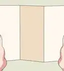
3Select a format for the brochure. The format you choose determines how the brochure folds. Consider which format is best for conveying the brochure information in a clear and accessible way. View various templates and experiment with them to find out what works for your project.[3]
- The most common choice is a classic tri-fold design, where the paper is folded twice to create 3 panels per side. Tri-fold brochures are inexpensive and able to fit in envelopes.
- Some brochures fold in half or accordion-style into 4 to 6 panels. Others have 2 front flaps that open like a gate. Many of these alternative formats are better for open spread presentations than mailing purposes.
-
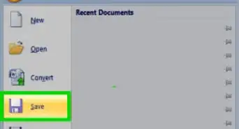
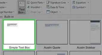
4Use a graphic design program to create the brochure. Open your favorite design program and use its settings menu to select a brochure template. Programs like Adobe InDesign or Photoshop have lots of different tools and layouts that will help you turn that template into the perfect brochure. For a free option, use a program like Microsoft Word or Adobe Spark.
- Working from a template simplifies the design process. Many design programs have templates that put some text and image boxes in automatically. If you don’t find one you like, try searching online for example templates to borrow.


Organizing the Content
-
1Place a call to action on the front page to draw the reader’s attention. The front page is what most readers see first, and it needs to show them what the brochure is about. The call to action is usually the brochure’s title, which you write in big letters at the top of the page. Then, include a relevant image, like a logo or picture, underneath it for visual appeal and additional information.[4]
- Make the title succinct and pair it with a striking image. For instance, an art museum brochure might have the museum’s name in big letters, followed by the museum’s most impressive piece of art.
- Many times, an image serves as the call to action. For example, if your brochure is about home repair services, you can put the company’s name and logo at the top of the page, then an image of a beautiful home interior at the bottom. Readers will understand what you’re selling.
- For an informational brochure on healthy eating, write a title like “Are You Getting Enough?” and include an image of a plate divided into the main food groups.
-
2Describe the brochure’s purpose in short, simple words. Devote the middle pages of the brochure to telling the reader what they need to know. Remember that the brochure is an advertisement, so it needs to be as straightforward as possible. List important details about the product, service, business, or event the reader needs to know about. Avoid industry jargon unless it is relevant to your audience.[5]
- For instance, if you’re advertising a festival, list the food, merchandise, and entertainment visitors can expect. Then, include a brief section about the festival and its history, such as “The fair has been delighting visitors across the country for over a hundred years.”
- Pick out vibrant words to create memorable descriptions. To advertise a new energy source, mention the sleek product that illuminates rooms for a fraction of the cost, for instance.
- Tailor your tone to your audience. If you’re advertising consultation services to businesses, using industry jargon like “Our services increase consultant productivity by 25% on average” is fine. Most of the times, brochures are for wider audiences and need to be simplified.
-
3Include client testimonials to promote products, services, and events. Positive testimonials lend legitimacy to goods and services. For a good testimonial section, take a few short but impactful quotes from real customers. Edit them for grammar and spelling mistakes, then put them in a list behind any pages devoted to the brochure’s purpose. Remember to include an attribution after each quote, such as the customer’s first name.[6]
- Ask customers for permission before using quotes. Many quotes come from written reviews, but asking a customer about a verbal quote is also fine.
- Testimonials usually go after a description of the product, service, or event, but there are ways to customize this section. Try spreading short testimonials out throughout the brochure or using 1 longer testimonial.
- An example of a good testimonial quote for a pest removal service is, “I’m so glad for the quick response time. It was the middle of the night and that bat was huge!”
-
4Spread relevant images across the brochure’s interior pages. Use your best images strategically to illustrate important text and divide up long paragraphs. Make sure they’re relevant to the brochure and its theme. Most images go above or below a box of text. Sometimes, putting them between text is an effective way to make a page look more dynamic.[7]
- For example, if you’re advertising a wildlife park, pictures of exotic animals and colorful habitats tell the reader what to expect.
- For a hotel, include pictures and descriptions of aspects like the pool, the exercise room, and the food service. Also, images of smiling employees suggest friendly, attentive service.
- Remember any background images you choose. They add visual weight to a brochure and may clash against pictures placed on top of them.
- You don’t need an image to accompany every block of text. Be prepared to cut out some of the images you have collected. If they aren’t adding to the brochure’s design, remove them.
-
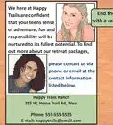
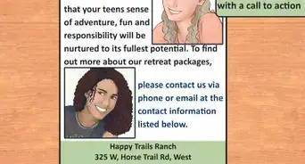
5Write contact information on the last page of the brochure. Including contact information invites readers to explore and learn more about the product. List details like a website link, a phone number, social media accounts, the office location, and hours when a business is open. Keep the information short, small, and easily visible.[8]
- The exact location for the contact section varies depending on the brochure design. Most of the time it will be on an outside panel that viewers see right away, so you keep the text small and supplement it with a big image.


Handling Aesthetics
-
1Include quality images that reinforce your brochure’s message. Graphics include artwork, a company logo, charts, and photographs. Make sure that all of the images are high-resolution, about 300 dpi. Pixelated, blurry images will defeat the purpose of a quality brochure. Gather enough images to spread throughout the brochure, approximately 1 per page.[9]
- Images are attention-grabbers. Pictures of happy dogs, for instance, stand out. Any reader drawn to the brochure will assume it’s about pets, pet supplies, or a similar topic.
- Brochures advertising products often feature customers using the product. A picture of a smiling customer using a vacuum cleaner in a pristine home, for instance, suggests that the product is high-quality.
- Stock images are okay to use, but make sure they are high-quality and suit your brochure. Search online to find databases filled with free images.
-
2Select a light color for the brochure’s background. White and pale blue are a few colors commonly used in brochures. Light colors brighten up pages without obscuring text. Use dark colors more sparingly, reserving them for background graphics or specific sections in the brochure. Most design programs have the ability to implement different backgrounds for each section of a brochure, allowing you to add more customization and color.[10]
- Remember that colorful backgrounds use more ink and cost more to print.
- For brochures aimed at businesses such as consultant advertisements, select a few cool or neutral colors like blue and white.
-
3Choose no more than 3 fonts for the brochure. Most brochures stick to a limited number of fonts, using 1 for the header or title, 1 for the subheaders, and 1 for the main text. Stick to simple fonts that are easy to read, like Helvetica, Verdana, and Ariel. Fonts need to be presentable and readable from a distance.[11]
- The header is the main title of the brochure. Subheaders are titles for sections such as “Our Mission” and “Workforce Solutions.”
- Remember what fonts you choose. Keep them uniform throughout the brochure for consistency.
-
4Write the brochure’s title in capital letters. These words are a reader’s introduction to your brochure, so they need to stand out. Make the title short and to the point, positioning it where it will stand out on the front page. Capitalize the first letter in each word or type in all uppercase letters so the title is readable from a distance.[12]
- Keeping the title black is acceptable, especially if you have a colorful logo or other graphics nearby. Black text pairs well with white backgrounds.
- Some examples of quality titles are “You Can Fly” for a skydiving advertisement and “Pure Water, Healthy Life” for a water filter advertisement.
-
5Break up long paragraphs into smaller sections or bullet points. The middle pages are easy to overcrowd with lots of text and images. To avoid this, keep blocks of text as short and to the point as possible. Distribute the important parts across the pages, pairing them with relevant images that will keep the reader engaged.[13]
- Create section titles to break up long blocks of text. For example, dedicate a page to the company’s mission statement followed by another section listing products and services the company provides.
- Bullet points are a great way to break up lists. For example, an art museum might list, “100 modern art exhibits,” “children’s activities,” and “art classes on weekends.” Separate the bullet points with a little bit of blank space.
- Longer text boxes are a better choice in some situations, such as when you’re advertising to business professionals or conveying legal information like a new drug’s side effects.
-
6Devote no more than half a page to each image and block of text. That way, you get a chance to use 1 striking image and a decent amount of text on each page. Spread out your images and text as much as possible in the brochure. Avoid overcrowding a page with lots of text or several large images, since your readers will have a hard time figuring out what you want them to learn.[14]
- Images and text boxes don’t have to be large. Make use of the white space on a page to make the brochure feel less busy.
- Using multiple smaller images on a page is possible, but make sure they are distinct and recognizable. Balance them out with text and blank spaces.
-
7Put a logo on the front page if the brochure is for a company. A good logo is a prominent part of advertising. Make it prominent so readers know who is responsible for it. It often needs to be on the front page near the title and on the back page near the contact information.[15]
- Many big events and non-profit organizations have logos. Logos are marketing tools for more than businesses.
- Use the colors in the logo to create a consistent theme. For example, if the logo has black and green in it, make some of the text green and some of the backgrounds black.
-
8Establish a consistent text and color theme throughout the brochure. Read back through your brochure after you finish designing it. Make sure all of the fonts look the same and are aligned the same way on every page. Also, check that the primary colors of the brochure carry through on every page. A consistent theme makes a brochure more visually appealing.[16]
- A good way to choose colors is by looking at the business’ logo. Make the logo’s colors into background colors and compliment them with white space.
- Take advantage of blank space. White space in the brochure breaks up blocks of text and color.
- If the brochure looks off, you may be using too many colors. Try making the background white and the text black. Simplicity is key. Photographs are colorful, so you don’t need to make other elements as bright.
- Keep the text aligned to the left like you would for any other document. Center-aligned text tends to look clunky in a brochure and ruins its consistency.


Printing the Brochure
-
1Pick a paper type that is durable but within your budget. Thicker paper holds up better but is more costly. Brochures made with thinner paper are more disposable but easier to fit into envelopes. Choose paper according to the purpose of the brochure and how many you need to make. Most print shops have a wide range of paper available and will help you select the kind you need.[17]
- Paper is labeled by GSM, or grams per square meter. Regular brochures are typically between 130 to 170 GSM. Use paper with a GSM between 170 and 300 for corporate brochures.
- Regular computer paper is fine for low-budget brochures. You can even print small quantities out at home and mail them.
- Thicker paper is better for large presentation brochures or ones that will end up in someone’s pocket. For example, advertisements for zoos and other big city attractions are often printed on thicker paper and set out in public locations.
-
2Choose coated paper to give a brochure a glossy finish. Regular brochures are printed on untreated paper. To make your brochure shiny, purchase coated printer paper or ask a printing service for it. Printing services charge an extra fee to use this type of paper, but sometimes the cost is worth it to make a brochure stand out among the competition.[18]
- For a standard mailing brochure, you don’t need the extra finish. Your customers will receive the brochure directly. Glossy finishes work better for business brochures and company advertisements.
- Many printing services also offer paper that gives brochures a matte finish. It makes colors look duller and flatter than normal. It isn’t used often, but it can make some brochures look unique.
-
3Send the finished brochure to a printer. To get professional results, you need a professional printer. There are many online and brick and mortar companies to choose from. Read reviews from other customers to find an experienced company willing to work with you to design the perfect brochure. Compare their prices before committing to a final print.[19]
- Before sending a file, contact your printer to find out what file format they require. Most companies prefer that you send your fonts and image files along with the design file so they get the final print perfect.
- Get a sample print to see how your final product will turn out. Brochures are a lot of work, so you may overlook some mistakes. A sample print gives you the chance to make corrections before printing a large order.
-
4Finished.


Community Q&A
-
QuestionHow do I fold a brochure?
 Community AnswerFold it in thirds, so it resembles a vertical rectangle.
 -
QuestionIs there a process for approval of brochures? Is that a company policy on who does brochures, or is it a part of the job description?
 Brett GilbertTop AnswererThe approval process is usually up to the designer. If the designer works for a company, they may need to speak to their boss or the client for a final approval. Consulting with the printer is also important for budgeting concerns and design options.
 -
QuestionI am making use of MS Word to create my brochure. Will it come out as well as a brochure designed in Adobe?Brett GilbertTop AnswererYes, using Word is fine. It's not exclusively set up for graphical editing, so it isn't as accessible and doesn't have as many features as programs like Adobe. However, it is perfectly serviceable for making a decent brochure.
Warnings
- Printing costs too much for you to end up with brochures you don’t like. Check your design carefully and print a test version to avoid waste!⧼thumbs_response⧽


References
- ↑ https://topnonprofits.com/know-your-target-audience-questions/
- ↑ https://topnonprofits.com/know-your-target-audience-questions/
- ↑ https://www.youtube.com/watch?v=A2rmygv370M&feature=youtu.be&t=18
- ↑ https://www.youtube.com/watch?v=DLeSPCTA9Wg&feature=youtu.be&t=124
- ↑ https://ctb.ku.edu/en/table-of-contents/participation/promoting-interest/brochures/main
- ↑ https://www.ftc.gov/tips-advice/business-center/guidance/ftcs-endorsement-guides-what-people-are-asking
- ↑ https://www.youtube.com/watch?v=2LdQ7LbcR-0&feature=youtu.be&t=414
- ↑ https://www.entrepreneur.com/article/179020
- ↑ https://www.youtube.com/watch?v=X43bRuX4hr8&feature=youtu.be&t=340
- ↑ https://evyw.wordpress.com/2007/10/01/how-color-affects-your-marketing/
- ↑ https://www.edutopia.org/blog/fonts-help-students-remember-read-jason-cranford-teague
- ↑ https://www.youtube.com/watch?v=DLeSPCTA9Wg&feature=youtu.be&t=124
- ↑ https://ctb.ku.edu/en/table-of-contents/participation/promoting-interest/brochures/main
- ↑ https://www.youtube.com/watch?v=2LdQ7LbcR-0&feature=youtu.be&t=723
- ↑ https://www.youtube.com/watch?v=X43bRuX4hr8&feature=youtu.be&t=329
- ↑ https://www.youtube.com/watch?v=HmP65at4EEw&feature=youtu.be&t=1339
- ↑ https://www.youtube.com/watch?v=hFxPmbUceoU&feature=youtu.be&t=41
- ↑ https://www.youtube.com/watch?v=Cc8uD2pZgpQ&feature=youtu.be&t=23
- ↑ https://ctb.ku.edu/en/table-of-contents/participation/promoting-interest/brochures/main
About This Article

To design brochures, try using a free design program like Microsoft Word or Adobe Spark, which often have free brochure templates that you can use. When you're designing your brochure, choose a light color for the background so it's easy to read, and try to stick with no more than 3 fonts so your design isn't overwhelming. Also, use high-quality images to make your brochure stand out. When you add text to your brochure, break it up into small sections or bullet points so your brochure doesn't look overcrowded. To learn how to print a brochure, scroll down!