This article was co-authored by wikiHow Staff. Our trained team of editors and researchers validate articles for accuracy and comprehensiveness. wikiHow's Content Management Team carefully monitors the work from our editorial staff to ensure that each article is backed by trusted research and meets our high quality standards.
This article has been viewed 42,679 times.
Learn more...
Word processing is a part of daily life. From essays to job resumes, you are constantly using word processing programs to type up important documents. No matter what it is, you need to make sure it can be read easily. If your reader thinks the document is too hard to read or understand, they may not read it all, which can be damaging. In order to improve the readability of a Word document, it’s important to use appropriate language, organize your Word document well, and design your Word document well. Having a clear and easy to read Word document will make your readers more likely to engage in your content, not just your formatting.
Steps
Using Appropriate Language in Your Word Document
-
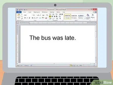
1Write in clear, simple sentences. Try to stick with one idea in each sentence so you don’t confuse the reader. This will make your sentences easy to understand and follow to the next idea or sentence.[1]
-
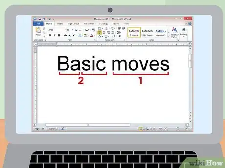
2Use one or two syllable words. Try to avoid too many three syllable words, since that can be confusing for the reader and harder to follow. Keep your words as transparent as possible.
- If you are writing a more academic piece, it may be a good idea to use longer words; however, keep your words as clear and direct as possible even if they are longer.
Advertisement -
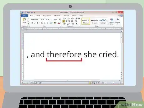
3Transition between different parts of your Word document. Transition words like “first,” “however,” or “therefore” can tell your reader how parts of the document relate to one another. It can help them move between sentences and between paragraphs more easily.
-
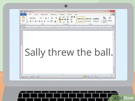
4Write in the active voice. In each sentence, make sure your subject is always doing an action, not having an action done to it. For example, write “Sally threw the ball,” rather than “The ball was thrown by Sally."[2]
-
5Keep your paragraphs skimmable. Your readers should be able to view the document and understand the point of each paragraph or section immediately. If you write in the active voice, this should be easy to do.[3]
Designing Your Word Document Well
-
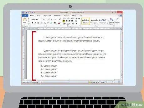
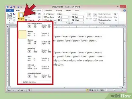
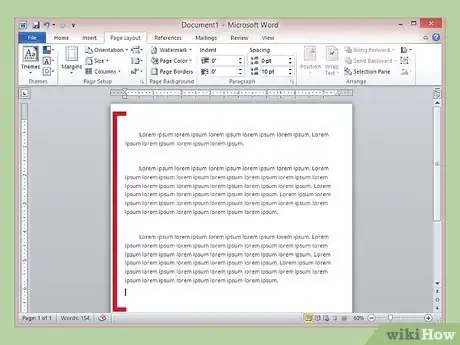
1Have a consistent margin size. The standard margin size is 1" all around. Sometimes, a document may have larger margins on the sides or top, depending on the header and footer of a document.[4]
-
2Use white space in the document consciously. Consider using headings, lists, or shorter paragraphs to highlight white space. This helps draw your reader’s attention to the things you want them to pay attention to.
-
3Have left adjusted alignment throughout. Your test should be justified to the left side of the page and have a ragged right margin. This is the standard for most documents and helps readers follow your document easily.
- Centered alignment can sometimes be useful to highlight headings or lists. Think about the use of white space when deciding to use centered alignment for parts of your Word document.
-
4Consider the several types of spacing. Spacing can be either designed by punctuation, margin size, line, or by paragraph. Each type of spacing may be appropriate for different types of Word documents.[5]
- Punctuation spacing is when you include 1 or 2 spaces after punctuation. This is not always standard, but can improve readability, especially in documents with a lot of text.
- Line spacing is usually only single or double-spaced. Double-spacing is usually required for academic writing, since it makes it easier to insert comments and corrections. However, typical business documents are single-spaced.
- Paragraph spacing has an empty line between paragraphs to break up the text. This is most commonly used for business documents that are single spaced as a way of transitioning.
Organizing Your Word Document Clearly
-
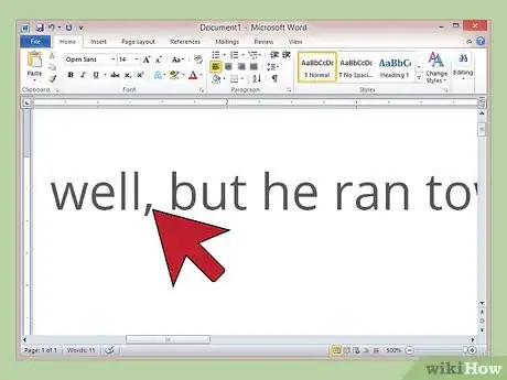
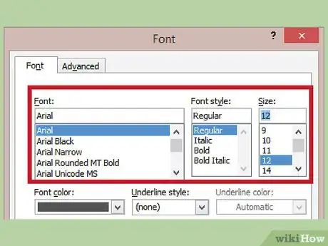
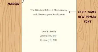
1Use appropriate font style and size. The standard font size is 12 point. It's often difficult to read font much smaller than this, so try not to make your font too smaller so your reader cannot read your document.[6]
-
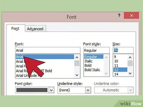
2Use appropriate font style. For a formal or business document, use a common, serious font such as Arial or Times New Roman. When writing to a friend or family member, you can use a less serious font, but make sure the end result is still legible.
-
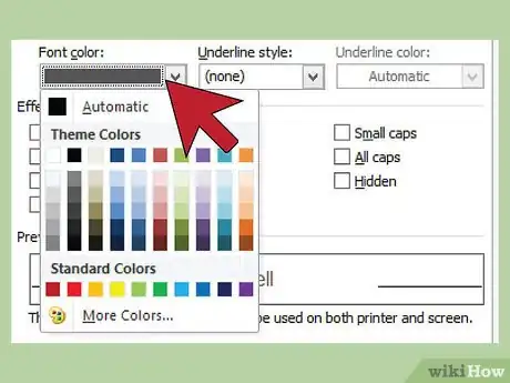
3Use black text. Colored text should only be used to highlight words. Don't use neon colors, or multiple colors within the same word.
-
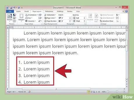
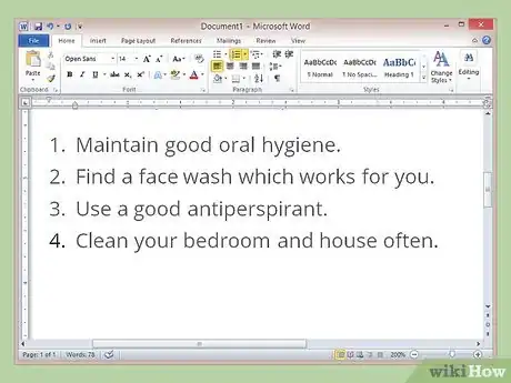
4Write numbered lists or bullets to highlight aspects of your Word document. If order is important, use a numbered list; if it is not, bullets may be the better option. In both cases, there should be a clear logical order to the list, so it does not seem arbitrary to your reader.
-
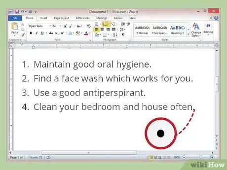
5End each list or bullet with a period if it’s a complete sentence. This will make sure your reader understands it to be a complete thought. If it’s not a complete sentence, make sure it connects to the previous section or heading clearly.
-
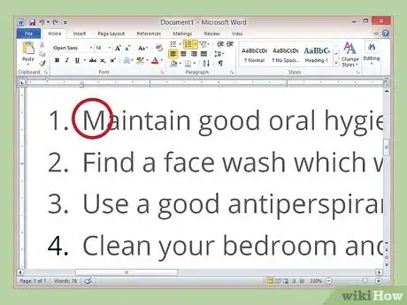
6Capitalize each bulleted or numbered list. Word documents will usually do this for you automatically. Each line or bullet should always start with a capital letter, even if it is a continuation of a previous section.
-
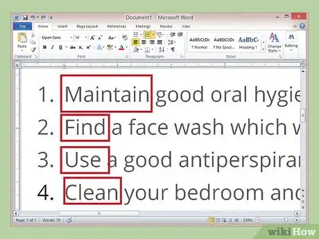
7Use parallel construction for your bullets or numbers. Begin each bullet or number with an active verb or consistently use an adjective-noun sequence. If your bullets are numbers are not consistent, it will be confusing for your readers.
-
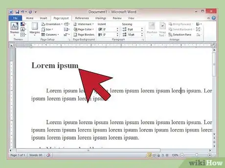
8Use headings when appropriate. Headings can help distinguish between topics or sections of your Word Document. This can help readers when skimming your document. Additionally, headings can be a great way to introduce bulleted or numbered lists.
References
- ↑ http://readabilityformulas.com/articles/how-to-improve-the-readability-of-anything-you-write.php
- ↑ http://www.plainlanguage.gov/howto/quickreference/dash/dashactive.cfm
- ↑ https://www.nih.gov/sites/default/files/institutes/plain-language/nih-plain-language-checklist.pdf
- ↑ http://practicaltypography.com/page-margins.html
- ↑ https://www.fonts.com/content/learning/fontology/level-2/text-typography/line-spacing-for-text
- ↑ https://bootstrapbay.com/blog/web-typography-best-practices/
