X
wikiHow is a “wiki,” similar to Wikipedia, which means that many of our articles are co-written by multiple authors. To create this article, volunteer authors worked to edit and improve it over time.
The wikiHow Tech Team also followed the article's instructions and verified that they work.
This article has been viewed 57,434 times.
Learn more...
Microsoft Excel’s spreadsheets work intuitively, forming charts and graphs from selected data. You can make a graph in Excel 2010 to increase the efficacy of your reports.
Steps
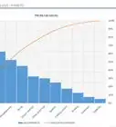
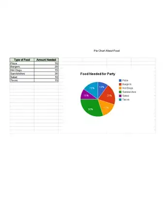
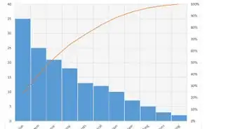
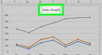
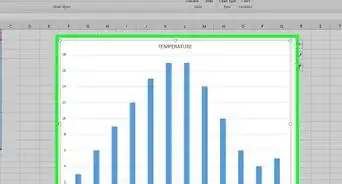
Sample Graphs


Part 1
Part 1 of 3:
Gathering Data
-
1Open your Excel 2010 program.
-
2Click on the File menu to open an existing spreadsheet or start a new spreadsheet.Advertisement
-
3Enter the data. Typing in a data series requires you to organize your data. For most people, you will enter items in the first column, Column A, and enter the variables for each individual item in the following columns.
- For example, if you are comparing the sales results of certain people, the people will be listed in Column A, while their weekly, quarterly and yearly sales results might be listed in the following columns.
- Keep in mind that on most charts or graphs, the information in Column A will be listed on the x axis, or horizontal axis. However, in the case of bar graphs, the individual data automatically corresponds to the y axis, or vertical axis.
-
4Use formulas. Consider totaling your data in the last column and/or last rows. This is essential if you are using a pie chart that requires percentages.
- To enter a formula in Excel, you highlight data in a row or column. Then, you click on the Function, fx, button and choose a type of formula, such as a sum.
-
5Type in a title for the spreadsheet/graph using the first rows. Use headings in the second row and column to explain your data. [1]
- Titles will be transferred to the graph when you create it.
- You can enter your data and headings into any section of the spreadsheet. If you are making a graph for the first time, you should aim to keep the data within a small area so it is easy to work with.
-
6Save your spreadsheet before continuing.


Advertisement
Part 2
Part 2 of 3:
Inserting Your Graph
-
1Highlight the data that you have just entered. Drag your cursor from the top left heading to the bottom right corner of the data.
- If you want a simple graph explaining only 1 data series, you should only highlight the information in the first column and the second column.
- If you want to make a graph with several variables to show trends, highlight several variables.
- Make sure you highlight the headers in the Excel 2010 spreadsheet.
-
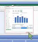
2Select the Insert tab on the top of the page. In Excel 2010, the Insert tab is located between the Home and Page Layout tabs.Advertisement
-
3Click on “Charts.” Charts and graphs are both available in this section and are used somewhat interchangeably as visual representations of spreadsheet data.
-
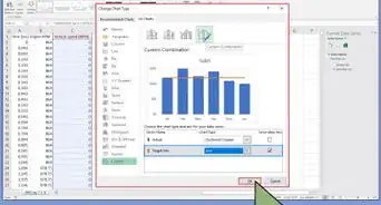
4Choose a type of chart or graph. Each type has a small icon next to it explaining what it will look like.
- You can return to this chart menu to choose a different graph option as long as the graph is highlighted.
-
5Hover your mouse over the graph. Right click with your mouse and choose “Format Plot Area.”
- Scroll through the choices in the left hand column, such as border, fill, 3-D, glow and shadow.
- Reformat the look of the graph by selecting colors and shadows according to your preferences. [2]


Advertisement
Part 3
Part 3 of 3:
Choosing Your Graph Type
-
1Insert a bar graph, if you are comparing several correlated items with a few variables. The bar for each item can be either clustered or stacked depending upon how you want to compare the variables.
- Each item on the spreadsheet is listed separately in a single bar. There are no lines connecting them.
- If you are using our previous example with weekly, quarterly and yearly sales, you can create a different bar in a different color for each individual. You can choose whether to have the bars side by side or condensed into a single bar.
-
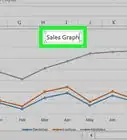
2Choose a line graph. If you want to plot data over time, this is the best way to show how a data series has changed over time, such as in days, weeks or years.
- Each piece of data in your series will be a dot on your line graph. The lines will connect these dots to show changes.
-
3Select a scatter graph. This type of graph is similar to a line graph because it plots data on an x/y axis. You can choose to leave the data points unconnected in a marked scatter graph or connect them with smooth or straight lines.
- The scatter graph is perfect for plotting many different variables on the same chart, allowing the smooth or straight lines to intersect. You can easily show trends in data.
-
4Opt for a chart. Surface charts are great for comparing 2 sets of data, area charts show changes in magnitude and pie charts show percentages of data. [3]


Advertisement


References
About This Article
Advertisement